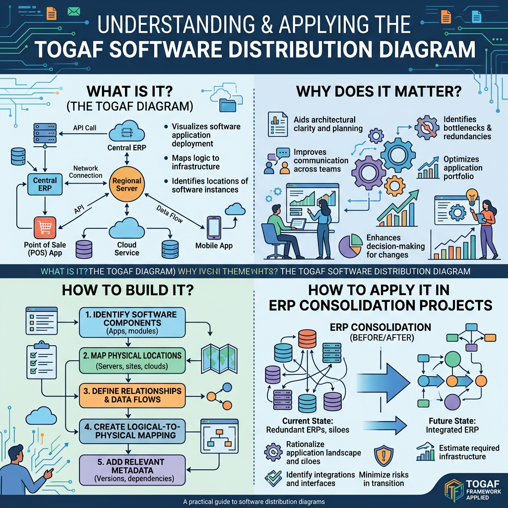
Introduction: Why Visibility into Software Deployment Can Make or Break a Transformation
In global ERP modernization and application consolidation programs, deciding which systems to keep and which to retire is only half the story. You also need the physical facts: where each piece of software actually runs, which servers or cloud platforms host it, and who maintains it. Plan a migration without those facts, and you will likely discover plant-level servers running forgotten satellite systems, or instances on mismatched versions, only after the plan is set. By then, both the schedule and the budget are at risk.
In TOGAF®, the artifact that captures this physical deployment picture is the Software Distribution Diagram. This article explains what the Software Distribution Diagram is, why it matters, what it contains, how to build it, and how to apply it in SAP and manufacturing contexts. It is written for Enterprise Architects (EAs) and project managers.
What Is the Software Distribution Diagram?
The TOGAF® Definition
The TOGAF® Standard defines the Software Distribution Diagram as follows:
“The Software Distribution diagram shows how application software is structured and distributed across the estate. It is useful in systems upgrade or application consolidation projects.”
“This diagram shows how physical applications are distributed across physical technology and the location of that technology.”
In other words, the diagram shows how application software is structured and deployed across the organization’s entire IT estate. It does this by mapping three elements: the physical applications, the physical technology they run on, and the location of that technology.
Where It Fits in the ADM
The Software Distribution Diagram is one of the artifacts that may be created in Phase C: Application Architecture of the ADM. In the TOGAF® Standard, it is listed under “3.6.5 Phase C: Application Architecture,” alongside artifacts such as the Application Portfolio Catalog and the Application Communication Diagram.
Although it references physical technology, it is not a Phase D (Technology Architecture) artifact. Its defining characteristic is that the application is the subject: the diagram shows where, and on what, each application is deployed. This distinction is easy to confuse, including on TOGAF® certification exams, so it is worth remembering.
Core Elements
| Element | Meaning | Examples |
| Physical Application Component | The actual product or instance that is deployed | SAP S/4HANA Production (PRD), MES (Plant A), PLM |
| Physical Technology Component | The specific platform that runs the application | Cloud VMs and databases, on-premises servers, SaaS platforms |
| Location | Where the technology resides | Tokyo data center, cloud region, North American plant, European site |
Community resources on TOGAF® artifacts present these three elements in tabular form, using columns such as “Software Distribution,” “Composed of,” “Deployed on,” and “Deployed at.” This is not a mandatory official format, however, so feel free to adapt the columns to your organization.
Purpose and Value
Purpose: Capturing the Physical Reality of Your Software on a Single Page
The purpose of this diagram is to close the gap between the logical application landscape and the actual runtime environment. Many organizations manage their application portfolio (the logical view) separately from their server inventory or CMDB (the physical view). The Software Distribution Diagram acts as a translation layer that connects the two.
Value 1: A Clear View of How Software Is Hosted
The TOGAF® Standard describes the benefits of the diagram this way:
“This enables a clear view of how the software is hosted, but also enables managed operations staff to understand how that application software is maintained once installed.”
The first benefit is clarity on how software is hosted. When you can see at a glance which instance, on which version, runs on which platform at which site, you can identify consolidation candidates and detect duplicate instances much faster.
Value 2: Understanding Post-Deployment Operations and Maintenance
The second benefit is that managed operations staff can understand how the software is maintained once installed. Responsibilities for patching, backups, and incident response become visible and are tied directly to where the software is deployed. The diagram also becomes a common language when you define roles and responsibilities with outsourcing partners and cloud providers.
Value 3: Better Decisions in Upgrade and Consolidation Projects
As the TOGAF® Standard explicitly states, the diagram is especially useful in “systems upgrade or application consolidation projects.” In EA practice, it informs decisions such as:
- Defining the migration scope, including uncovering “hidden” systems that still run locally at plants
- Prioritizing instance consolidation and data center rationalization
- Estimating savings in licensing, maintenance contracts, and infrastructure costs
- Sequencing cutovers and identifying environments that require parallel runs
How It Differs from Related Artifacts
The Software Distribution Diagram is most effective when combined with other artifacts that serve similar purposes.
| Artifact | Phase | Primary Focus | Relationship to the Software Distribution Diagram |
| Application and User Location Diagram | Phase C | Geographical distribution of applications and the locations from which users access them | Adds the “who uses it, and from where” perspective |
| Application Migration Diagram | Phase C | Migration from baseline to target | Uses the current deployment as the starting point for migration steps |
| Environments and Locations Diagram | Phase D | Which locations host which applications and technologies, plus development and pre-production environments | Provides deployment detail from the technology perspective |
| Networked Computing/Hardware Diagram | Phase D | The “as deployed” view in a distributed network computing environment | Adds detail on the network and security layers |
As a rule of thumb, use Phase C to capture deployment from the application perspective. Then use Phase D to elaborate the infrastructure perspective, including environment segmentation, networking, and security.
How to Build It: A Practical Five-Step Approach
Step 1: Define Scope and Granularity
Decide whether the scope covers the entire enterprise or is limited to a specific business unit, region, or transformation program. Then choose the level of granularity: by product, by instance (PRD/QAS/DEV), or by client. For consolidation projects, instance-level granularity is recommended.
Step 2: Gather the Inputs
- Application Portfolio Catalog (application inventory)
- CMDB, server inventory, and cloud resource lists
- License and maintenance contract information
- Site list (data centers, plants, sales companies)
Step 3: Map the Three Elements
Create a mapping table that links each physical application to its physical technology and its location. Start in tabular form, and convert it into a diagram only after the content has been agreed in review. This approach reduces rework.
Step 4: Add Operations and Maintenance Attributes
To deliver the value TOGAF® highlights, understanding how software is maintained after installation, add attributes such as the maintenance owner (internal or vendor), version, end-of-support date, and backup method.
Step 5: Review It and Embed It in Ongoing Governance
Review the diagram with infrastructure and operations teams and with site IT leads. Then register it in your change management process and Architecture Repository so that it is updated continuously. The key is to keep it from becoming a one-off survey document.
Use Case: ERP Consolidation at an Automotive Tier 1 Supplier
The following is an illustrative example based on a hypothetical global automotive parts manufacturer.
Background
A Tier 1 supplier operates plants in Japan, North America, Europe, and Asia, and each region runs a different ERP. The company is planning to consolidate these systems onto a single global SAP S/4HANA instance.
Sample Software Distribution Diagram (Tabular Format)
| Physical Application | Physical Technology | Location | Maintenance Owner | Consolidation Approach |
| SAP ECC 6.0 (Japan HQ) | On-premises database server | Tokyo data center | Internal IT + maintenance vendor | Migrate to S/4HANA |
| Local ERP (North American plant) | Virtual server | North American plant server room | Local IT | Consolidate into S/4HANA and retire |
| Local ERP (European sales company) | External hosting | European data center | Outsourced | Consolidate into S/4HANA and retire |
| MES (each plant) | On-site plant servers | Each plant | Plant IT | Retain (redesign interfaces with S/4HANA) |
| PLM | Cloud IaaS | Cloud region (Japan) | Internal IT | Retain |
| SAP S/4HANA (target) | Cloud (private cloud) | Cloud region | Cloud provider + internal IT | Build new |
Key Insights from the Diagram
- The local ERPs in North America and Europe have different maintenance models (local IT versus outsourced). The migration plan must therefore align each retirement date with the corresponding contract end date.
- MES is distributed across on-site plant servers. Even after consolidation, integration points with S/4HANA will remain at multiple sites, which makes interface standardization a critical challenge.
- Starting from the current deployment makes it easier to lay out migration steps and parallel-run periods in the Application Migration Diagram.
Practical Checklist for Enterprise Architects
- Have you defined the scope and granularity (product, instance, environment) up front?
- Are logical applications (the portfolio) mapped to physical instances?
- Have you included cloud, SaaS, and plant-local platforms without gaps?
- Are location definitions (data center, region, plant) standardized across the enterprise?
- Have you added operational attributes such as maintenance owner, version, and end-of-support date?
- Have you verified consistency with Phase D artifacts, such as the Environments and Locations Diagram?
- Is there a mechanism to keep the diagram updated through change management and the Architecture Repository?
Conclusion
The Software Distribution Diagram is an Application Architecture artifact created in TOGAF® Phase C. It shows which physical technology each physical application runs on and where that technology is located. It delivers two core benefits: a clear view of how software is hosted, and an understanding of how that software is operated and maintained after deployment. It is especially powerful in systems upgrade and application consolidation projects.
In transformations that span many sites and platforms, such as a global ERP consolidation, this diagram gives stakeholders a shared foundation of current-state physical facts. Start small in tabular form, then use it to drive your migration planning and operating-model design.
Reference Links
- The Open Group, “TOGAF Standard — 3.6.5 Phase C: Application Architecture (Software Distribution Diagram)”: https://pubs.opengroup.org/togaf-standard/architecture-content/chap03.html
- The Open Group, “TOGAF 9 Artifact: Software Distribution Diagram”: https://pubs.opengroup.org/architecture/togaf90-doc/epf/TOGAF9/workproducts/Software%20Distribution%20Diagram_28014AF5.html
- The Open Group, “TOGAF 9.2 — Architectural Artifacts”: https://pubs.opengroup.org/architecture/togaf92-doc/arch/chap31.html
- QualiWare Center of Excellence, “TOGAF Artifacts”: https://coe.qualiware.com/resources/togaf/togaf-artifacts/
- Scribd, “TOGAF 9 Artifact Summary (Tabular Example)”: https://www.scribd.com/document/55704697/Microsoft-Word-ToGAF-9-Artifact-Summary
Disclaimer
Parts of this article were developed with reference to generative AI suggestions and were reviewed, refined, and supplemented based on the author’s professional expertise and judgment.

Leave a Reply